What Does it Mean to Optimize a Landing Page?
Landing page optimization includes a range of activities designed to improve the page’s performance against certain KPIs. These KPIs include, but are not limited to:
- Conversion rate
- Click-through rate
- Bounce rate
- Average session duration
But how do you really optimize a landing page? There are quite a few steps you need to take for this purpose and they are tied to specific elements of a landing page, be it a headline, contact form, social proof, or even overall web page layout. However, the general best practice for all of these elements typically revolves around only 3 key concepts – simplicity, persuasiveness, and actionability.
Landing Page Optimization Checklist
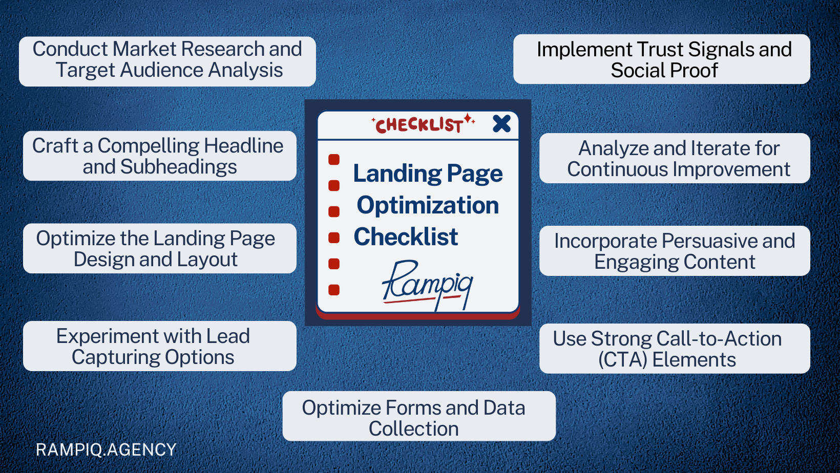
Through working with many B2B SaaS companies over the years, we’ve identified 9 key activities, which make up our landing page optimization checklist:
- Conduct Market Research and Target Audience Analysis
- Craft a Compelling Headline and Subheadings
- Optimize the Landing Page Design and Layout
- Experiment with Lead Capturing Options
- Optimize Forms and Data Collection
- Use Strong Call-to-Action (CTA) Elements
- Incorporate Persuasive and Engaging Content
- Implement Trust Signals and Social Proof
- Analyze and Iterate for Continuous Improvement

1. Conduct Market Research and Target Audience Analysis
Know the nuances of your market – it is the first step in understanding how to optimize landing pages for lead generation. Techniques such as examining competitors’ strategies, scrutinizing Google search results, and delving into paid ads on platforms like Google and LinkedIn will definitely provide valuable insights. Oftentimes tools like SEMrush and Ahrefs also prove instrumental in dissecting competitors’ strengths and weaknesses.
One often overlooked strategy is analyzing the landing pages employed in paid advertising on Google or LinkedIn. This not only offers a glimpse into current industry trends but also helps identify successful elements worth incorporating. It’s a subtle but potent strategy to reel in customers effectively.
Making the landing page content relevant to your audience with the target audience is equally critical. Knowing the pain points, aspirations, and preferences of potential clients allows for the creation of a compelling narrative. A personalized approach, backed by market research, enhances the likelihood of engaging prospects and steering them toward conversion.
2. Craft a Compelling Headline and Subheadings
Invest time and creativity in the development of your headline as well as subheadings. They serve as the first point of contact for your landing page, and if they are of subpar quality, users will immediately leave.
Some must-haves for well-crafted headlines and subheadings are:
- Clarity: Ensure that your headline communicates your primary value proposition clearly and succinctly.
- Relevance: Create headlines to resonate with the specific pain points and needs of your target audience.
- Actionability: Encourage user engagement with language that prompts action, such as “Transform Your Workflow” or “Unlock Efficiency.”
- Selling Benefits: Focus on how your SaaS solution will improve your customer’s business rather than on what it does.
To be specific, the above tips are on full display when looking at successful SaaS companies such as:
- Tidio: Never miss a sales opportunity again.
- Appcues: Turn your product into a growth engine.
- Abstract: Design collaboration without chaos.
- Hotjar: The fast and visual way to understand your users.
3. Optimize the Landing Page Design and Layout
Make sure the layout of your landing page isn’t confusing, clumsy, or unengaging. User attention spans are getting shorter and shorter, with authoritative research in 2021 claiming it to be as short as 8 seconds on average. This finding only further stresses the importance of a well-structured landing page layout.
Here are some practices you can employ to avoid that:
- Minimalism: Embrace a clean and minimalist design to not overwhelm visitors.
- Consistent Branding: Ensure that the design elements align with your brand identity for a cohesive user experience.
- Use of Whitespace: Utilize whitespace strategically to enhance readability and draw attention to key elements.
- Intuitive Navigation: Design a user-friendly navigation structure, guiding visitors seamlessly through your content.
- Visual Hierarchy: Prioritize information with a clear visual hierarchy, emphasizing key points through size, color, and placement.
A point worth mentioning separately is the increasing significance of mobile responsiveness as users spend more and more time on their phones each year. Not only does a mobile-friendly design ensure a good user experience across smartphones and tablets, but it also positively impacts search engine visibility. That is because Google and other search engines continue to place their emphasis on mobile-friendly websites for their search rankings.
4. Experiment with Lead Capturing Options
Don’t ignore the traditional lead-capturing methods, such as the classic “Request a Demo” and “Contact Us” forms – they have long been used to great success and are still very relevant today. With these, you get to invite potential clients to explore the SaaS solution in-depth and offer a direct line of communication with your team to address inquiries.
Some best practices for traditional lead gen forms:
- Fewer Form Fields: Reducing the number of required fields naturally reduces the amount of effort a user needs to put in, which increases the likelihood of form completion.
- More Qualifying Questions: At the same time, feel free to integrate questions that qualify leads based on criteria such as company size or marketing budget. Make sure that these are optional fields so as not to contradict the point made above.
- Use Quizzes or Questionnaires: Add interactive quizzes onto your landing page that not only promote user engagement but also culminate in capturing the user’s email.
Likewise, with the evolving user expectations, you may want to apply a more creative approach so as to optimize the lead-capturing process. For instance, some of the more advanced ways of obtaining lead information are:
- Access to Interactive Product Demo: Offering prospects an interactive product demo on your page provides a hands-on experience, showcasing the value of your SaaS solution.
- Adding a “Book a Demo” Calendar Widget: Instant scheduling through a calendar widget streamlines the process, making it convenient for leads to book a demo at their preferred time.
- Adding a Chatbot with Qualifying Questions: Incorporating a chatbot equipped with qualifying questions replaces the traditional form, offering a conversational and interactive avenue for capturing lead information.
5. Optimize Forms and Data Collection
Remember that lead forms are not just about gathering information; it’s about creating a seamless experience that improves user engagement.
To make data collection more effective, consider implementing the following practices:
- User-Friendly Layout: Design forms with a user-friendly layout, arranging fields logically to guide visitors through the information-gathering process.
- Strategic Placement: Position your forms on the landing page in a way that makes them easily accessible without overwhelming the user. Consider placing forms both prominently and contextually within the content.
- Progressive Profiling: Implement progressive profiling, collecting additional details gradually over time. This approach respects the user’s time and keeps the interaction focused on relevant information.
- Automation for Efficiency: Utilize automation tools for automated responses and follow-ups that enhance user experience and keep leads engaged.
- CRM Integration: Integrate forms with lead gen tools like CRM to ensure that collected data is efficiently organized, allowing for further personalized interactions and targeted marketing efforts.
Remember that, CRMs aside, you can also optimize landing page for lead generation with the help of various B2B SaaS lead gen software – read this article to find out about 64 powerful tools to boost your conversion rates even more.
6. Use Strong Call-to-Action (CTA) Elements
Make use of persuasive CTAs as they can also significantly impact lead generation, turning neutral visitors into engaged prospects. They serve as the guideposts, directing users toward the desired actions such as scheduling a demo, downloading a resource, or initiating contact.
Here are some best practices for strong CTAs:
- Clear and Concise Language: Use straightforward language that clearly communicates the value proposition and the action expected from the user.
- Power Words: Infuse CTAs with power words that evoke emotion and prompt a response, such as “Unlock,” “Transform,” or “Discover.”
- Strategic Placement: Position CTAs prominently within the content, ensuring they are easily visible and accessible.
- Compelling Design: Employ visually appealing design elements, such as contrasting colors and engaging visuals, to draw attention to the CTA.
As with many other elements on this list, A/B testing is also crucial here for maximizing the positive impact of CTAs. Make sure to experiment with variations in the language used in the CTA and test different color schemes and designs to determine which one appeals to the audience the most. Also don’t forget to explore the impact of CTA placement, whether it’s at the beginning, middle, or end of your landing page.
7. Incorporate Persuasive and Engaging Content
Invest in the quality and resonance of your content as it’s instrumental in establishing a connection with the audience and fostering trust. Persuasive content positions the business as an authority in its field, instilling confidence in potential clients about the value and expertise you offer.
When planning and executing content creation activities, make sure to:
- Learn Your Audience: Tailor the language and tone to match the preferences and expectations of your target demographic.
- Highlight Benefits: Focus on the benefits of your SaaS solution, demonstrating how it addresses the specific needs and challenges of your audience.
- Use Neutral Language: Avoid jargon and complex terminology; instead, opt for clear wordings that are easily digestible.
- Practice Storytelling: Craft a narrative that illustrates the journey of clients who have benefited from your SaaS solution. Personal stories create a compelling connection and demonstrate real-world applications
- Incorporate Testimonials: Incorporate testimonials from satisfied clients, emphasizing the positive impact of your solution. Authentic testimonials serve as social proof of your SaaS’s effectiveness.
8. Implement Trust Signals and Social Proof
Integrate trust signals and social proof into your landing pages since they act as powerful tools for instilling confidence in your SaaS product in potential clients. This confidence assures visitors of the credibility and effectiveness of the offered solution and makes them much more likely to convert.
We suggest the following ways to boost your product’s social proof:
- Testimonials: Display testimonials from satisfied clients prominently on the landing page. Ensure authenticity and specificity in the testimonials to enhance their impact.
- Reviews: Showcase positive reviews from reputable platforms or industry influencers, highlighting the positive experiences of users
- Certifications and Awards: If applicable, display relevant certifications, awards, or recognitions, reinforcing the SaaS provider’s expertise and commitment to quality
- Case Studies and Success Stories: Present in-depth case studies and success stories that detail the challenges faced by clients and how your SaaS solution provided effective solutions.
9. Analyze and Iterate for Continuous Improvement
Regularly analyze the performance of your B2B SaaS landing page. This way, you will stay responsive to market trends, user behaviors, and evolving business goals. By adopting an iterative approach, you not only maintain relevance but also uncover opportunities that can lead to sustained success.
To enable further improvement, you first need to have clear objectives for your page, whether it’s increasing conversions or improving user engagement. Based on those goals, you will then regularly review associated key metrics such as CTR (click-through rate), conversion rates, bounce rates, average session duration, pages per session, and many others.
Tools to use for performance analysis and key metric tracking:
- Google Analytics: A staple in web analytics, Google Analytics provides comprehensive insights into user behavior, traffic sources, and other metrics such as conversion rates.
- Heatmaps: Tools like Crazy Egg or Hotjar offer heatmaps that visually represent where users are clicking, scrolling, and engaging the most on your landing page.
- Paid Ad Data: Platforms like Google Ads, or Facebook Ads also offer built-in conversion tracking to monitor the effectiveness of your paid lead generation efforts.
- A/B Testing Tools: Implement tools like Optimizely or VWO for A/B testing, allowing you to compare variations of your landing page to determine which performs better.
