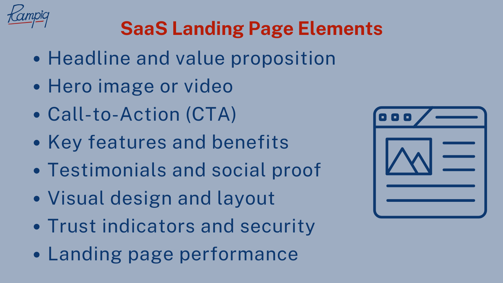
SaaS Landing Page Elements
We recommend that your SaaS product landing page addresses the following elements – and does it well:
- Headline and value proposition
- Hero image or video
- Call-to-Action (CTA)
- Key features and benefits
- Testimonials and social proof
- Visual design and layout
- Trust indicators and security
- Landing page performance
Let’s break each of those elements down and see what can be done to improve them.

Headline and Value Proposition
In SaaS, your landing page’s headline and value proposition are the cornerstones of your marketing strategy. To create a high-converting SaaS landing page, it’s crucial to understand that your headline serves as the first point of contact with your potential customers. Hence, this brief statement should be laser-focused on addressing the primary pain points of your target audience.
In parallel, the value proposition is where you shouldn’t just enumerate your features but rather articulate the ‘why’ behind your SaaS product:
- Avoid fluff and jargon; instead, use clear and concise language to communicate how your SaaS solution can solve their specific problems.
- Ask yourself why your solution is indispensable, what sets it apart, and what specific benefits users can expect – your proposition should be a compelling promise and a direct solution to your audience’s needs;
- Showcase how your SaaS can improve their bottom line, enhance productivity, or streamline operations – and make sure to leverage data and statistics to support your claims;
- Include testimonials or case studies to illustrate how your SaaS has benefited other businesses – it will also be a powerful way to show the value of your solution.
Hero Image or Video
The Hero Image/Video serves as the visual gateway to your product or service. Like your headline, it should instantly communicate the essence and value of your SaaS solution to your visitors; and it should align well with said headline.
To make the most of this element, consider doing the following:
- Position it at the top of the page to ensure it’s the first thing visitors see without needing to scroll;
- Use visuals that vividly showcase your software in action, allowing potential customers to see its benefits firsthand;
- Accompany it with a concise, clear tagline that succinctly conveys what your SaaS can do for them;
- Ensure that the element is mobile-responsive – it should adapt seamlessly to different screen sizes and devices, including both desktop and mobile;
- If possible, try to make it interactive, allowing users to click, watch, or explore further, guiding visitors to take specific actions or navigate the website.
Call-to-Action (CTA)
The Call-to-Action (CTA) is the prompt that guides visitors toward taking a specific action, whether it’s signing up for a free trial, requesting a demo, or making a purchase. To ensure your CTA effectively converts visitors into customers, here are some actionable insights:
- Make your CTA straightforward and use concise, action-oriented language – phrases like “Get Started,” “Sign Up Now,” or “Request a Demo” are classic examples as visitors should instantly understand what to do;
- Place your CTA in a way so that it’s prominent on the page, often above the fold (visible without scrolling); at the same time, you can also strategically place secondary CTAs lower on the page to capture visitors who want to learn more before committing;
- Ensure that it is large enough to be easily clickable on mobile devices, but not so large that it dominates the entire page;
- Make it visually stand out – use contrasting colors, bold fonts, or buttons to draw attention; at the same time, you may also surround the CTA with whitespace so as not to clutter the area around it with other distracting elements;
- Naturally, your CTA should align with the value proposition you’ve established elsewhere on the page – it should reinforce the benefits of your SaaS, reminding visitors of what they’ll gain by taking action.
Key Features and Benefits
Key features and benefits is a section where you must provide potential customers with a strong reason to choose your software. Here’s how you may effectively present these:
- While listing features are essential, focus more on the benefits your SaaS offers – explain how each feature directly addresses your target audience’s pain points;
- Keep your descriptions concise and easy to understand – use simple, jargon-free language since visitors should quickly grasp the value of each feature and benefit.
- Enhance this section with icons or visuals that will complement your text descriptions – this will help convey the message and make your content more engaging;
- Emphasize what sets your SaaS apart from the competition; if there’s a feature or benefit that’s particularly unique, don’t hesitate to make it your focal point;
- If possible, incorporate brief testimonials from satisfied customers that relate to specific features as it will reinforce the value you’re promising;
- Consider adding interactive elements like tooltips or hover-over descriptions so that when a visitor hovers over a feature, they receive a brief explanation of it.
Testimonials and Social Proof
Testimonials and social proof are powerful tools for building trust and credibility – this section is where your satisfied customers get to express their opinions on your SaaS product. Some tips on how to drive more conversions with it:
- Make sure your social proof looks and is authentic – testimonials should come from real customers who have used and benefited from your SaaS; whenever possible, also include the name and photo of the person providing the testimonial;
- Showcase a diverse range of testimonials – this includes different industries, use cases, and personas to demonstrate the versatility and broad appeal of your software;
- Testimonials should be specific and detailed. Encourage customers to share their experiences, highlighting particular features or benefits that they found most valuable;
- Incorporate statistics or numbers to emphasize the impact of your SaaS, i.e. “Our software helped increase sales by X%“;
- When possible, make use of video testimonials – those can be exceptionally powerful as seeing and hearing a satisfied customer can be more persuasive than text alone;
- Position testimonials strategically throughout your landing page for SaaS. They can be placed near the top to build immediate trust or near the Call to Action (CTA) to address any lingering doubts and encourage conversions;
- Keep your testimonials up-to-date; a testimonial from five years ago may not carry the same weight as a recent one.
Visual Design and Layout
A visually appealing visual design and a well-structured layout are also part of SaaS landing page best practices; let’s take a look at some best practices for both of them:
- Keep your design clean and uncluttered – use a minimalistic approach to make the content and key elements stand out so that visitors can easily understand where to focus their attention;
- Maintain a consistent design with your brand identity, ensuring that colors, fonts, and visual elements align with your overall branding to reinforce your company’s image;
- Establish a clear visual hierarchy – use size, color, and placement to guide visitors’ eyes to the most important elements, such as the headline, CTA, and key benefits of your SaaS product;
- Keep navigation simple and intuitive – visitors should easily find their way around your page; the navigation menu, if included, should also be easy to access but still unobtrusive;
- Consider using a grid layout to organize your content as they provide a structured and balanced appearance, making your page look professional;
- As an aforementioned point, your SaaS landing page design must be fully mobile responsive – the layout must adapt to various screen sizes;
- Last, but not least, always prioritize user experience – test your layout to ensure that it’s easy for users to navigate, scroll, and find information.
Trust Indicators and Security
Trust indicators and security is a sometimes overlooked element, but it’s also very critical as it reassures your potential customers against software-related risks. Not only that – if your landing page for SaaS has trust indicators such as certifications and badges, it may help the page rank higher. That is due to Google’s E-EAT policy (Experience, Expertise, Authoritativeness, and Trustworthiness) whereby a lot of focus is placed on a page’s legitimacy and integrity. And here’s how to make your page have those qualities:
- If your SaaS has received industry awards or recognitions, prominently display these on your landing page;
- Also, display trust seals and badges from recognized security providers or industry associations;
- Provide clear and accessible contact information, including a physical address and customer support details;
- Provide a link to your privacy policy, making it easy for visitors to find information about how their data is handled; also make sure your privacy policy is transparent and easy to understand;
- Ensure your landing page uses HTTPS to encrypt data – this not only enhances security but also assures visitors that their interactions with your site are secure;
- Briefly outline the security measures you have in place to protect user data – encryption methods, data storage practices, and compliance with data protection regulations will all go a long way;
- Create an FAQ section that addresses common security and trust-related questions.
Performance Optimization
Lastly, you should never ignore landing page performance optimization – it must load quickly, function smoothly, and provide a positive user experience. And not only is it critical for the above purposes, but it also matters a lot when it comes to SEO. Such parameters as page loading speed, layout, and responsiveness are among the deciding factors for search engines whenever they attribute a certain ranking to a page.
So, here are some optimization tips for both better user experience and search rankings:
- Regularly test your landing page’s speed using tools like Google PageSpeed Insights to identify areas that need improvement;
- Compress images to reduce file sizes without compromising quality so that page loading times, especially on slower connections, get improved;
- Enable browser caching to store frequently used elements locally on the user’s device – this reduces the need for repeated downloads when users return to your page;
- Implement lazy loading for images and other media – this means that content loads as users scroll down, reducing the initial page load time;
- If you use videos, ensure they are properly compressed and that video players are not set to auto-play, which can slow down page loading;
- Minimize the use of redirects since each redirect adds extra time to page loading;
- Reduce the number of HTTP requests by limiting the use of external scripts and plugins;
- Use a content delivery network (CDN) to distribute your content across multiple servers globally, meaning faster delivery of your page to users in different geographic locations.
