Should Prices Be Included in a B2B SaaS Pricing Page?
Yes, prices should be included in B2B SaaS pricing pages.
Transparency in pricing builds trust and streamlines the decision-making process for potential clients. A clear display of pricing eliminates ambiguity, allowing businesses to quickly assess the value against their budget constraints.
It’s important, however, to present pricing information in a way that resonates with the target audience. B2B SaaS customers or subscribers often seek value and long-term ROI, so your pricing page should contextualize the costs within the broader value proposition of your SaaS product pricing. For instance, aligning price points with specific features, pricing page design, benefits, or business outcomes can help clients understand what they’re paying for and why it’s worth it.
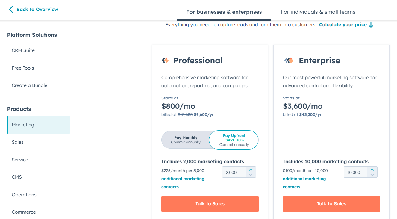
You must also consider offering flexible pricing models. B2B clients vary in size, needs, and budget. Tiered pricing or customizable options can cater to a broader range of customers. For example, small startups might prefer a basic, cost-effective plan, while larger enterprises might seek comprehensive, higher-tier packages.
Components of High-Converting Pricing Page
A high-converting B2B SaaS pricing page is more than just numbers and labels; it’s a strategic blend of elements designed to guide and convince potential clients. Here’s a breakdown of its key components:
- Transparent Pricing Structure: Price transparency means displaying all costs, including setup fees or additional charges. This approach avoids customer frustration and builds trust.

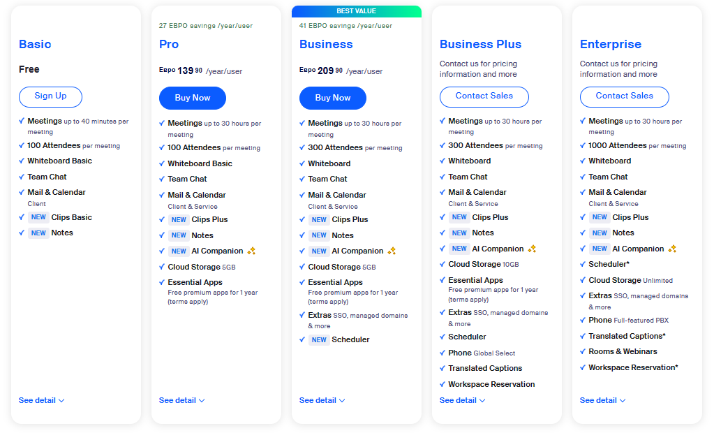
- Value Proposition for Each Tier: Highlight specific benefits for each pricing tier. This could include increased efficiency for the basic tier, advanced analytics for a premium tier, or 24/7 support for the enterprise tier. Tailor these benefits to different customer segments. Zoom does this expertly in their pricing page as shown below.

- Feature Breakdown: Detail what features are included in each tier. Use a comparison chart to distinguish between tiers visually, making it easier for customers to compare and decide.

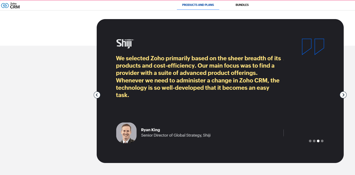
- Customer Testimonials or Case Studies: Share success stories relevant to each tier. For instance, a small business success story for the basic tier or a large corporation’s story for the enterprise tier. This creates relatability and trust.

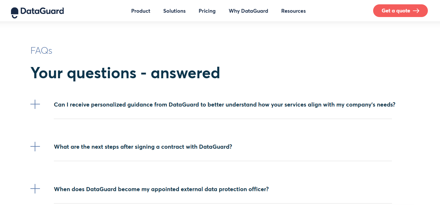
- FAQ Section: Address common pricing questions, subscription terms, and detailed product functionalities. This section should be comprehensive, covering a range of potential customer inquiries.

- Clear Call-to-Action (CTA): Make CTAs prominent and action-oriented, like “Sign Up Now” for immediate tiers or “Contact Us” for custom plans. The goal is to guide the customer smoothly to the next step.

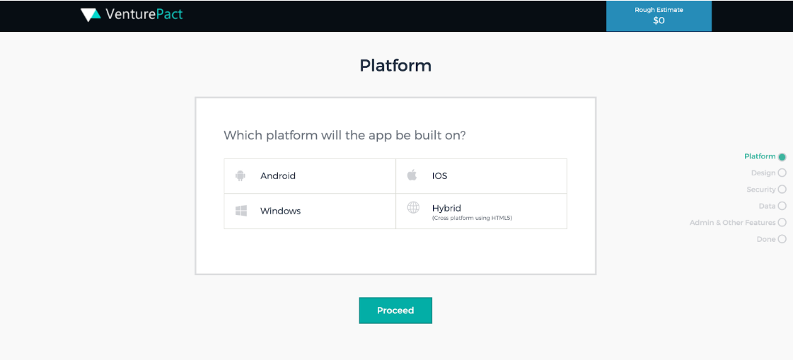
- Interactive Elements: Incorporate interactive tools like price calculators, which allow customers to input their data and receive personalized pricing estimates, enhancing engagement and perceived value. For example, VenturePact implements an interactive page that guides the user to select the most suitable plan for their business.

- Trust Signals: Displaying security certifications, compliance badges, and recognizable client logos can significantly boost credibility and reassure potential customers about data security and reliability.

- Contact Information: Ensure that contact details for sales or support are easily accessible, providing a direct line for inquiries, which helps build a relationship with potential customers.

Each of these elements plays a crucial role in making the pricing page informative and persuasive, aiding potential clients in making an informed decision quickly and confidently.
18 Expert Tips for Designing a High-Converting B2B SaaS Pricing Page
Creating a high-converting B2B SaaS pricing page is an art that blends strategy with design. Let’s explore the top expert tips that will help you design a pricing page that looks great and drives conversions.
Prioritize Simplicity and User Experience
Keep your pricing page simple and intuitive. A clean, straightforward design helps users understand options quickly. Reduced cognitive load makes the decision process easier and more pleasant for potential clients.
Why It Works: Simple and intuitive pricing pages align with cognitive fluency, a psychological principle that suggests people prefer easily digestible information.
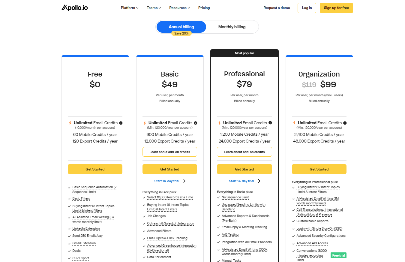
Experiment with Listing the Most Expensive Plan First
Place the highest-priced plan first to set a premium perception and make other plans seem more affordable. This strategy uses price anchoring to influence customer perception of value and affordability.
Why It Works: Presenting the most expensive plan first establishes a high-value perception, making other, more affordable plans seem even more attractive in comparison.

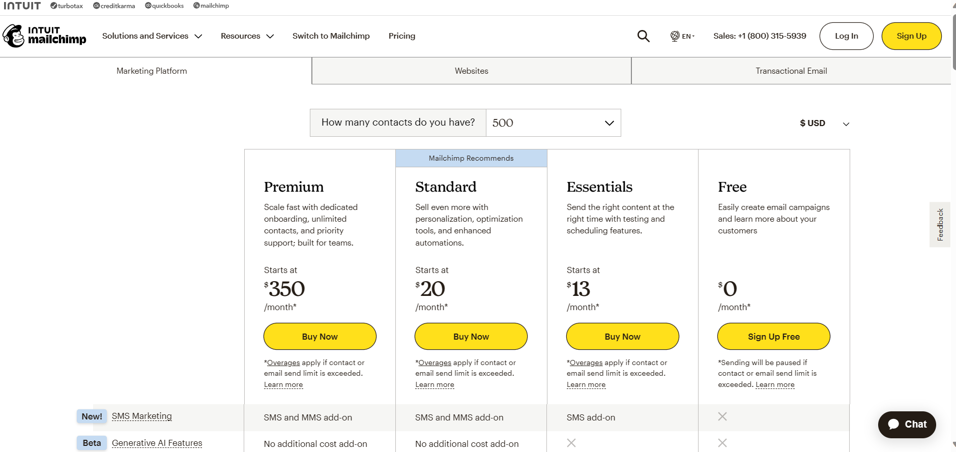
Highlight Your Recommended Plan
Emphasize a plan you recommend, often a mid-tier option, to guide customers toward a popular choice. This simplifies decision-making for users by suggesting a default option.
Why It Works: This strategy taps into the psychological principle of social proof and choice simplification. Customers often feel more confident choosing an option that’s presented as the preferred or popular choice, leading to increased satisfaction and reduced decision fatigue.
Offer a Free Trial to Recommend Upgrading Later
Introducing a free trial version in your pricing strategy is an effective way to engage potential customers. It lowers the entry barrier, allowing users to experience your product’s value without initial financial commitment.
Why It Works: Free trials leverage the ‘try before you buy’ psychology, increasing the likelihood of purchase as users become familiar and satisfied with the product. In addition to attracting new users, this strategy helps build trust and demonstrates the value of your product, paving the way for users to upgrade to paid plans.

Recommend Add-Ons
Suggest relevant add-ons or extra features alongside your plans to provide additional value. This approach can increase average revenue per user by catering to specific needs and preferences.
Why It Works: This approach taps into the customer’s desire for customization and personalization. By offering add-ons, you’re allowing users to tailor the product to their specific needs, increasing perceived value and satisfaction.
Aim for 3 Pricing Plans Maximum
Limiting your pricing to three main plans is effective due to the psychological concept of choice overload and decision fatigue. This ‘Rule of Three’ helps in simplifying the decision-making process for customers as three options provide enough variety to cater to different needs without overwhelming customers.
Why It Works: Psychological studies suggest that too many choices can lead to decision fatigue, making it harder for customers to decide. With fewer options, customers can more easily compare and understand the differences, leading to a higher likelihood of making a purchase.
Three-tiered pricing structures also align with common customer segments: basic, standard, and premium, making it easier for customers to identify where they fit.
Consider Tailoring the Pricing Pages to User Journey Stages
Design pricing pages that cater to different stages of the user journey, reflecting their evolving needs. Such personalization can significantly enhance the user experience by offering relevant options based on their current interaction level with your product.
Why It Works: This strategy acknowledges that customers have varying needs and preferences at different interaction levels with your product. Personalization in marketing boosts customer satisfaction and loyalty as it demonstrates understanding and value of the customer’s unique journey with the product.
Implement Pricing Plans per Buyer Persona
Tailoring pricing plans for different buyer personas involves understanding their unique characteristics and needs. For example:
- Startup Persona: Startups often have limited budgets but require scalability. A pricing plan for this persona could offer a basic but flexible package with the option to add features as the business grows.
- Enterprise Persona: Large enterprises may prioritize comprehensive features and dedicated support. A premium plan with advanced features, customization options, and dedicated account management would appeal to this group.
- Freelancer Persona: Freelancers might look for affordability and simplicity. A cost-effective plan with essential features and easy-to-use interfaces would be suitable.
- Tech-savvy Persona: This group seeks the latest features and integrations. Plans for them could include cutting-edge technology offerings and opportunities for customization.
Why It Works: By creating plans that resonate with each persona, you increase the relevance of your offering, enhancing the likelihood of conversion. Each plan should communicate directly the persona’s pain points and aspirations.
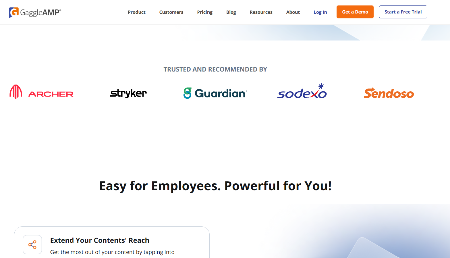
Include Testimonials or Popular Logos
Add testimonials or logos of well-known clients to establish credibility and trust. Displaying proof of satisfaction from existing customers can greatly influence new customers’ perceptions and decision-making.
Why It Works: This approach leverages social proof, where people are influenced by the actions and approvals of others. Seeing positive feedback or endorsements from reputable clients can significantly sway new customers’ perceptions, making them more comfortable and confident in choosing your service.

Pair Prices with Benefits on the Page
Link each price point with clear benefits, demonstrating the value of each plan. This helps in justify the cost and aligns the customer’s expectations with the value proposition of your service.
Why It Works: This strategy effectively uses the principle of value perception. By directly linking the cost to specific benefits, it helps customers understand exactly what they are paying for, making the price seem more reasonable.
Integrate a Quick Product Sign-Up
Integrating a quick product sign-up process directly on the pricing page can significantly streamline the path to conversion, encouraging more immediate sign-ups.
Why It Works: This approach minimizes friction in the conversion funnel. The easier and quicker it is for a potential customer to sign up, the less likely they are to abandon the process.
Show Dynamic Pricing Options with a Slider
Use a slider to display dynamic pricing options, allowing users to interact and personalize their plans. An interactive element enhances user engagement and provides a clearer understanding of how different options affect pricing.
Why It Works: This interactive approach plays into the psychological need for control and clarity. When users can adjust a slider to see how changes impact pricing, it gives them a sense of control over their purchase decision and helps them better understand the value proposition at different price points.
Implement Live Chat on the Page
Include a live chat feature for real-time assistance, answering queries, and guiding potential customers. An instant communication tool can be instrumental in addressing doubts and facilitating decisions on the spot.
Why It Works: Live chat offers instant communication, which is key in today’s fast-paced digital environment. This real-time support can reduce decision-making time, clear doubts, and thus enhance user satisfaction and the likelihood of conversion.

Consider Incorporating a Pricing Calculator
Incorporating a pricing calculator on your SaaS pricing page enables users to estimate costs based on their specific requirements, enhancing transparency and decision-making.
Why It Works: By allowing users to input their exact needs and immediately see the cost implications, it builds trust through transparency.
Color Code the Plans
Using different colors to differentiate between plans on your SaaS pricing page can make it more visually appealing and easier to navigate.
Why It Works: Colors can draw attention, create emotional responses, and aid in memory recall. This approach makes the comparison of different plans more intuitive and enhances the user’s ability to quickly identify the best option for their needs, thus improving the overall user experience.
Use Engaging Visuals
Incorporating engaging visuals or graphics that align with each pricing tier can significantly enhance user engagement and comprehension on your SaaS pricing page.
Why It Works: Visuals are processed faster in the brain than text, making them a powerful tool for communication. They can quickly convey the essence of each plan, breaking down complex information into digestible and memorable content.
Mobile Optimization
Optimizing your pricing page for mobile devices is essential, considering the growing trend of mobile browsing and the fact that many B2B decision-makers use mobile devices for business research.
Why It Works: A mobile-friendly design ensures accessibility and convenience. It reflects an understanding of modern browsing habits and enhances the user experience.
Highlight Customer Support Options
Highlighting the level of customer support available with each plan reassures clients about the post-purchase assistance they can expect, adding value to their investment.
Why It Works: Detailing support options addresses the psychological need for security and assurance, especially in B2B environments where support can be critical to operations. This clarity in communication demonstrates a commitment to customer satisfaction beyond just the initial sale.

The key to a successful B2B SaaS pricing page lies in understanding and implementing these diverse strategies. Remember, the goal is to make the decision-making process as smooth and informed as possible for your potential clients.
5 High-converting B2B SaaS Pricing Page Examples for Inspiration
To inspire you, we’ve curated five standout examples of the best SaaS pricing pages from industry leaders. These examples demonstrate a variety of approaches, from interactive elements to straightforward clarity, each successful in its way.
Dataguard

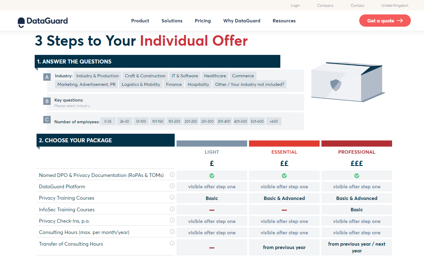
Dataguard’s pricing page excels due to its interactive questionnaire that guides users to a suitable package, akin to effective SaaS landing page design elements. This strategy enhances user engagement by creating a personalized and interactive decision process.
Key Takeaways:
- The interactive questionnaire personalizes the user experience, encouraging active participation and leading to more informed and satisfied decisions.
- Clear tier names simplify the understanding of different service levels, aiding in quick and easy decision-making.
This approach makes the pricing page not just a list of options, but a user-friendly tool that assists in the selection process.
Adobe

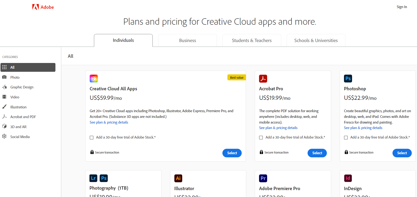
Adobe’s pricing page exemplifies simplicity and clarity, embodying best practices in user experience design. Its clean layout allows for easy navigation and understanding of options.
Key Takeaways:
- Concise headlines aid in quickly grasping the essence of each plan.
- Straightforward plan comparisons facilitate easy differentiation between options, aiding in decision-making.
While simplicity is a strength, additional interactive elements like personalized recommendations could further enhance user engagement.
Salesforce Marketing Cloud

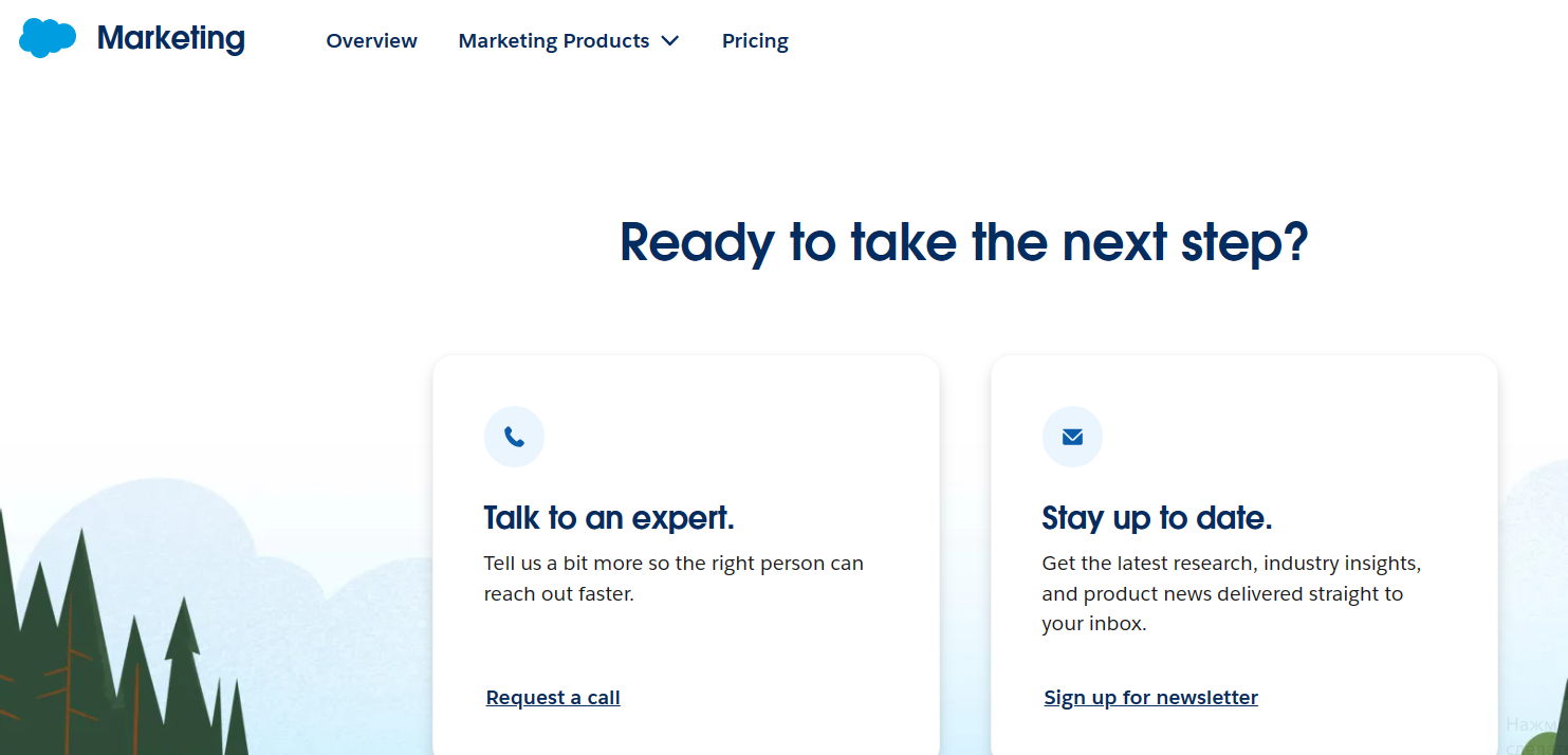
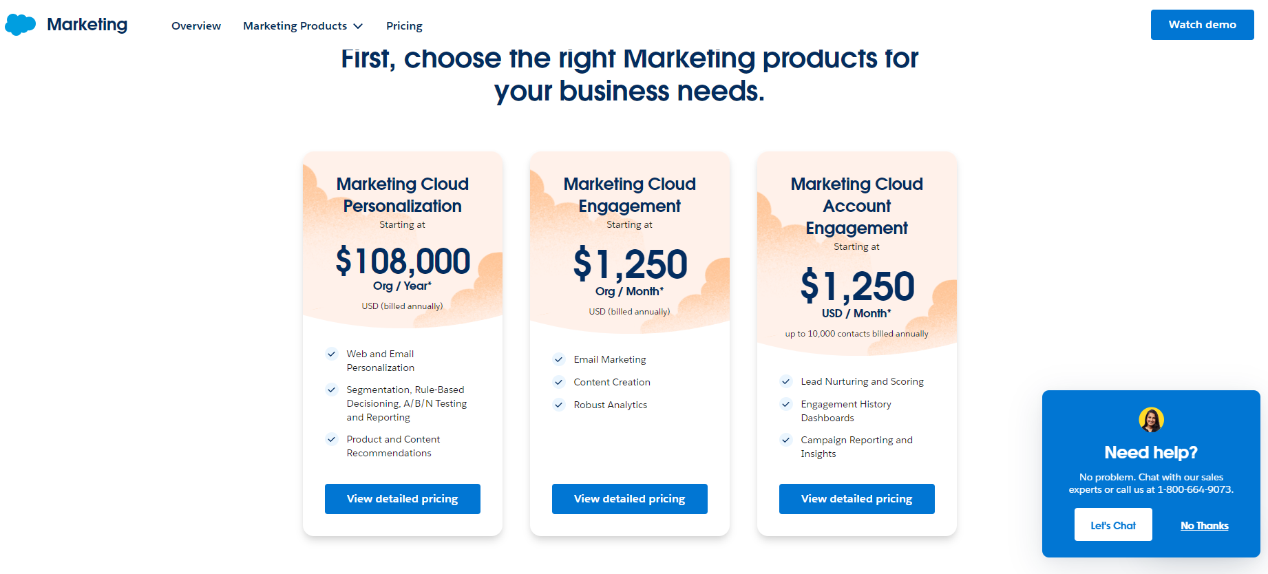
Salesforce Marketing Cloud’s pricing page stands out for its transparency and clarity, showcasing concrete pricing and a clear ‘Contact Us’ call-to-action (CTA).
This design effectively pairs prices with benefits, offering clear value propositions for each tier. The inclusion of a table with a detailed feature breakdown aids customers in determining the most suitable plan.
Key takeaways:
- The transparent presentation of prices builds trust and sets clear expectations.
- The structured feature breakdown assists in easy comparison, facilitating informed decision-making.
Salesforce’s pricing page strategy effectively communicates value and simplifies the selection process, aligning well with customer-centric design principles. Integrating interactive elements like a cost calculator could enhance user engagement by providing personalized pricing estimates.
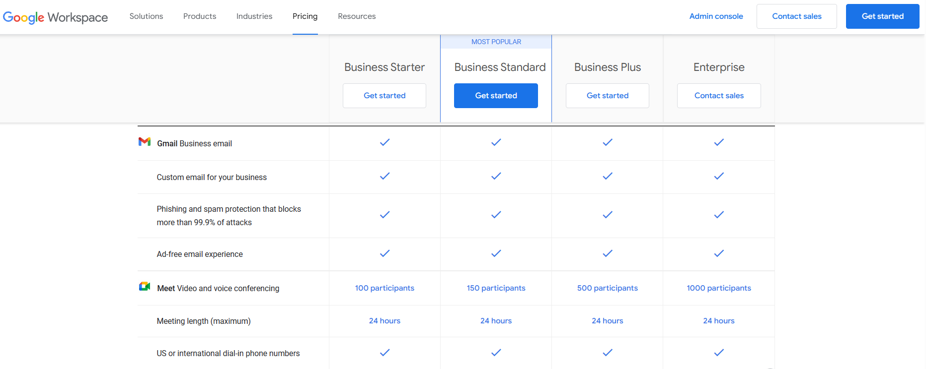
Google Workspace

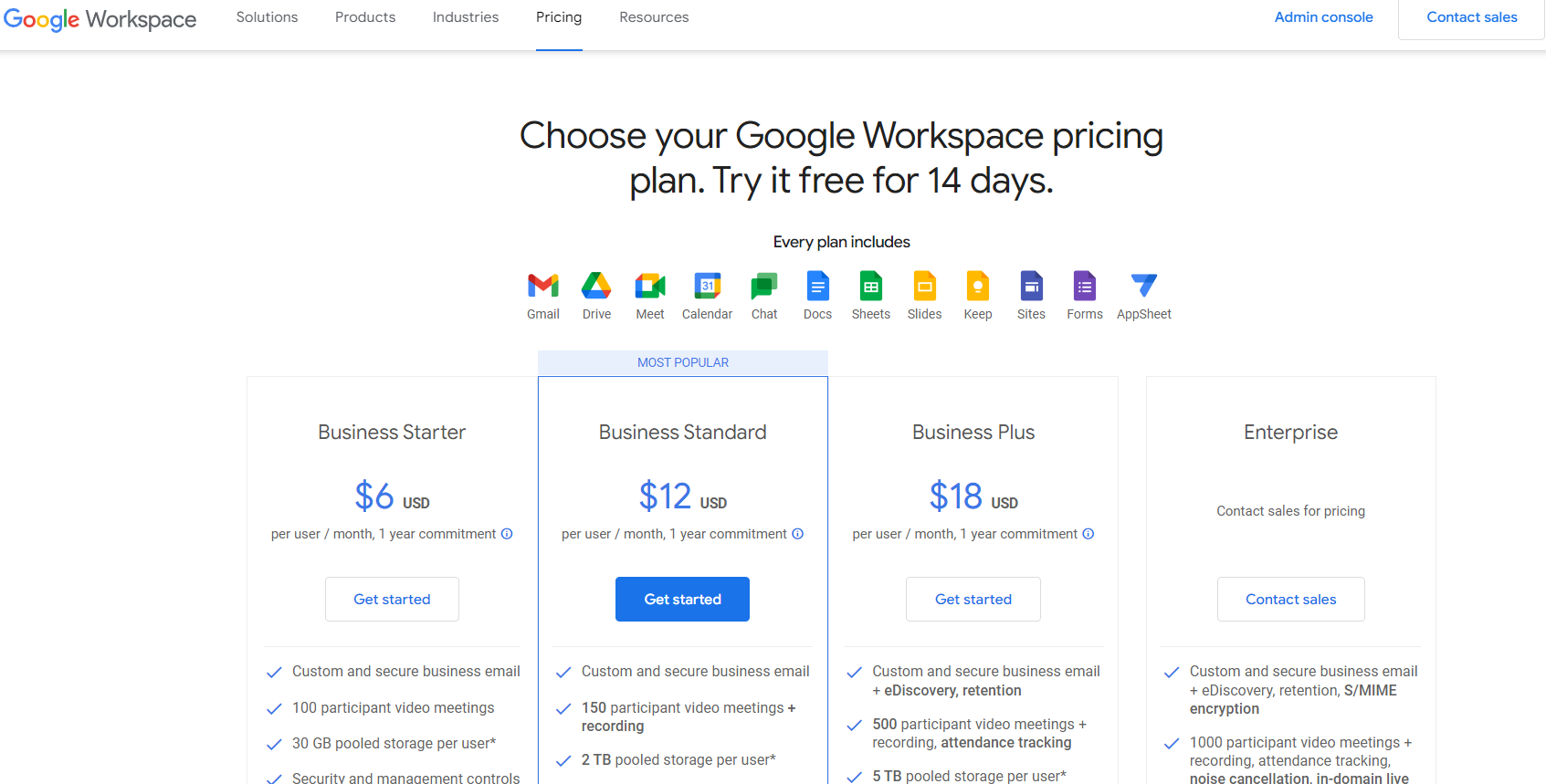
The Google Workspace pricing page excels in its intuitive design and use of white space, enhancing information accessibility and digestibility. This layout is especially effective for mobile users and presents information. Including freemium options showcases a strategic approach to attracting users, while the detailed FAQ section preemptively addresses customer queries.
Key Takeaways:
- The spacious design minimizes cognitive overload, making the page appealing and easy to navigate.
- Freemium options serve as an entry point, encouraging users to try the service with the option to upgrade.
Google Workspace’s pricing page effectively combines simplicity with functionality, making it a model of user-friendly design in the SaaS industry.
Slack

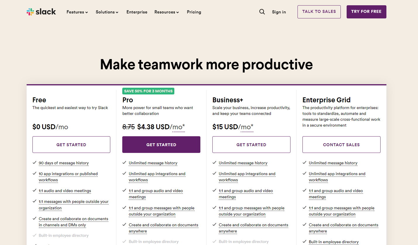
Slack’s pricing page exemplifies the power of simplicity in SaaS pricing models. The page is marked by its clarity and straightforwardness, making it easy for users to discern and select the appropriate plan. Slack limits its pricing plans to three clear options, avoiding overwhelming users with too many choices.
The inclusion of a free version prominently on the page serves as an enticing entry point for new users, highlighting the benefits of upgrading. An extensive feature analysis table aids in detailed comparison while displaying logos from reputable companies using Slack adds a layer of trust and credibility.
Key Takeaways:
- The simplicity of choice reduces decision fatigue, making it easier for users to commit.
- The presentation of the free version as an entry point lowers the barrier to adoption.
Slack’s pricing page strategy balances simplicity with thorough information, making it user-friendly and increasing its appeal to a wide range of users. Adding personalized recommendation features or interactive elements could further tailor the user experience to individual needs, enhancing the decision-making process.
Assess the Effectiveness of Your SaaS Pricing Page
Step 1: Measure Conversion Rate
Start by tracking how many visitors become customers or take a desired action on your pricing page.
Step 2: Analyze User Engagement
Use web analytics to evaluate how users interact with your page, focusing on metrics like
Step 3: Collect User Feedback
Implement feedback tools or surveys on your page to gather direct input from users about their experience and any obstacles they face.
Step 4: Conduct A/B Testing
Test different variations of your pricing page to determine which elements resonate most with your audience and lead to higher conversions.
Step 5: Check SEO Performance
Ensure your pricing page is search engine optimized to attract your target audience effectively.
